
from emotion to floral art - behind the scenes

What does guilt look like in flowers? And what colour has relief? What shape does anger have? I tried to answer these very abstract questions for my fathers book about grief. Read all about it in this blogpost! Get comfortable, it’s a long one :)
If you haven’t see the photos of this project - take a look here!
First of all, I wrote on top of my project notes: “KEEP IT SIMPLE & THINK SMALL”. Caps lock, bold, everything. So naturally I spend hours stringing hyacinth flowers, weaving a 3 meter wide grid out of metal wire, drying & sieving sand, creating stormy skies and braiding dried grasses that might have been a bit too stiff to bend.
I always tell my members that my motto is ‘work harder, not smarter’. Keeping things simple is somehow not an option for my brain. I probably need an update or something ;)
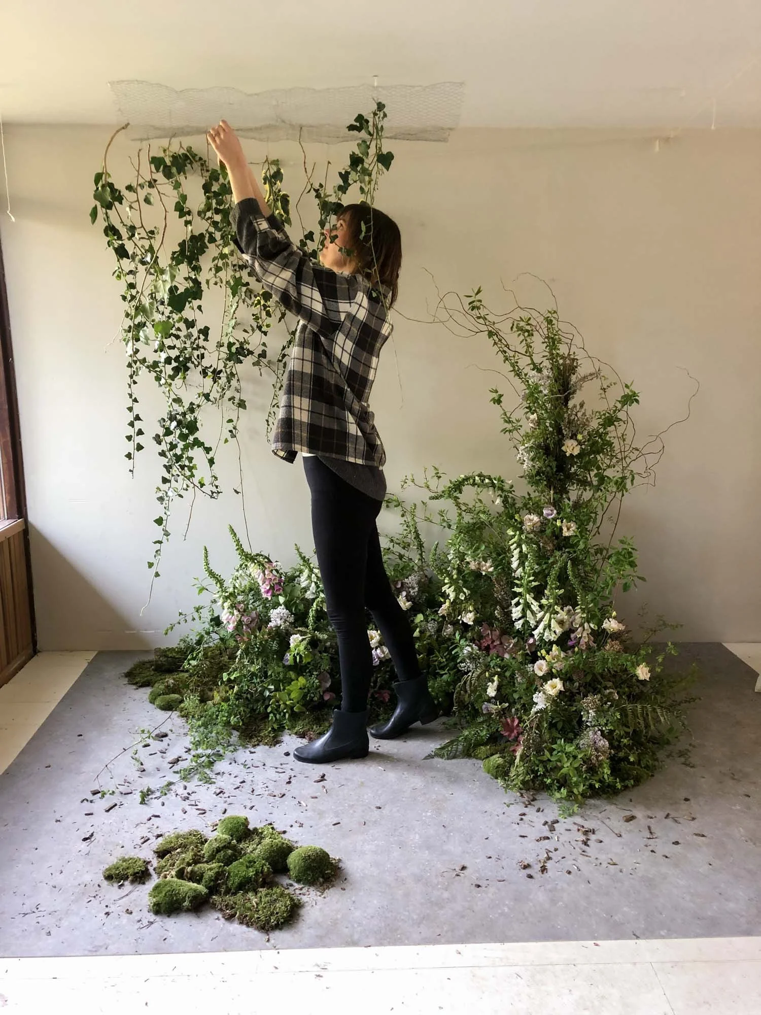
Chapter: Time
My inspiration: the growth of the natural world. How Earth will take over, over time.
I wanted to create a small forest, something that looked like it grew in an urban environment. Like plants pushing up through cracks in the concrete. The base consists of forest like ingredients like foxgloves, heuchera and ferns. Ivy was an obvious addition to imitate vines taking over. After all, that’s what ivy does. I added moss and even logs to emphasise the natural look.
Oh and the ‘concrete floor’ is a piece of vinyl from a home decor store!

It feels a bit redundant to mention, but every installation I made is foam free! And this particular installation was actually recycled, sort of. I made an installation with my student during a 1:1 masterclass, with this chapter in mind. There was a lot of overlap between her class and my design for this, so why waste all the work & materials?

This is what the installation looked like during our class - shot on film. I pulled out some of the flowers we used, moved the trays around (ingredients and all) and added more elements to emphasise the ‘Time’ story. A super quick transformation!
Meanwhile, this is proof you can create beautiful, versatile designs using the foam free techniques I teach! If you want to learn more, read all about my classes here.

Chapter: Guilt
My inspiration: storm clouds that feel heavy and dark.
I found the perfect material for this theme. Dried statice. It looks soft from afar but is pretty sharp up close. I felt symbolism in that - as well as thorns under my skin ;)
But also practically, this particular type of statice has wide tops, which provided nice coverage for these clouds. Any florists out there feeling the irony of creating flower CLOUDS? I sure did!
The base of these clouds are simple chicken wire balls, suspended from my studio ceiling with fishing lines. My friend Danique van Kesteren helped me edit the final photos and she had to edit out a LOT of fishing line. Sorry. I made the front clouds moveable so I could play with the composition. The back row is secured on both sides to prevent them from spinning.


I spend a lot of time hanging that dark backdrop.. only to realise the clouds looked brighter and less stormy because of the high contrast. I know, duh. But when you’re in the middle of the process of creation, sometimes you can’t think clearly. You need some distance (and a lunchbreak ;)) to see it all. I took the black out again (also out the video btw) and started shooting. Very happy these are dried flowers so they didn’t wilt on me in the meantime!
You have to watch the timelapse above to see how big this installation actually was. You can’t tell from photos, but the total width was just under 3 meters I think.
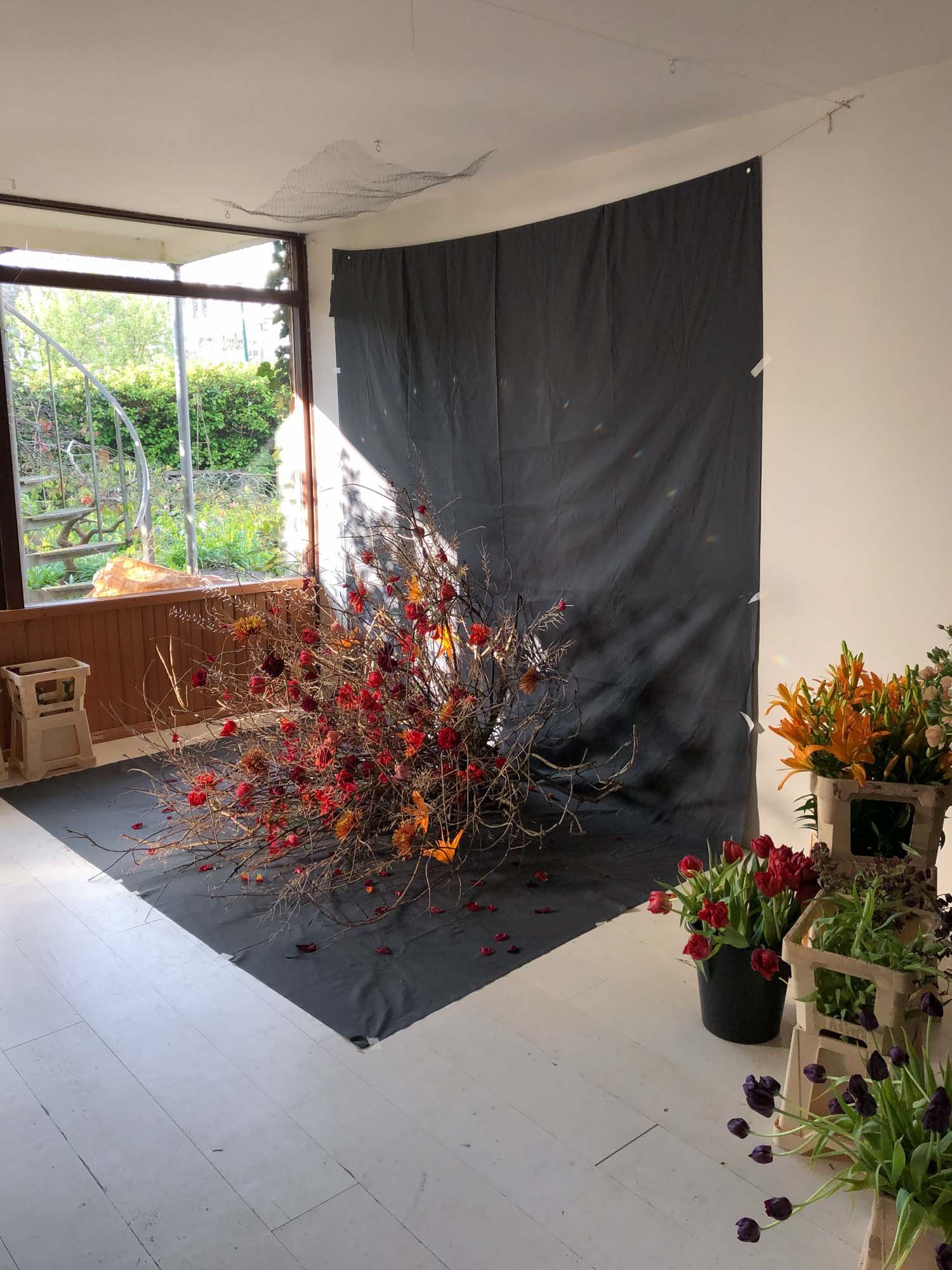
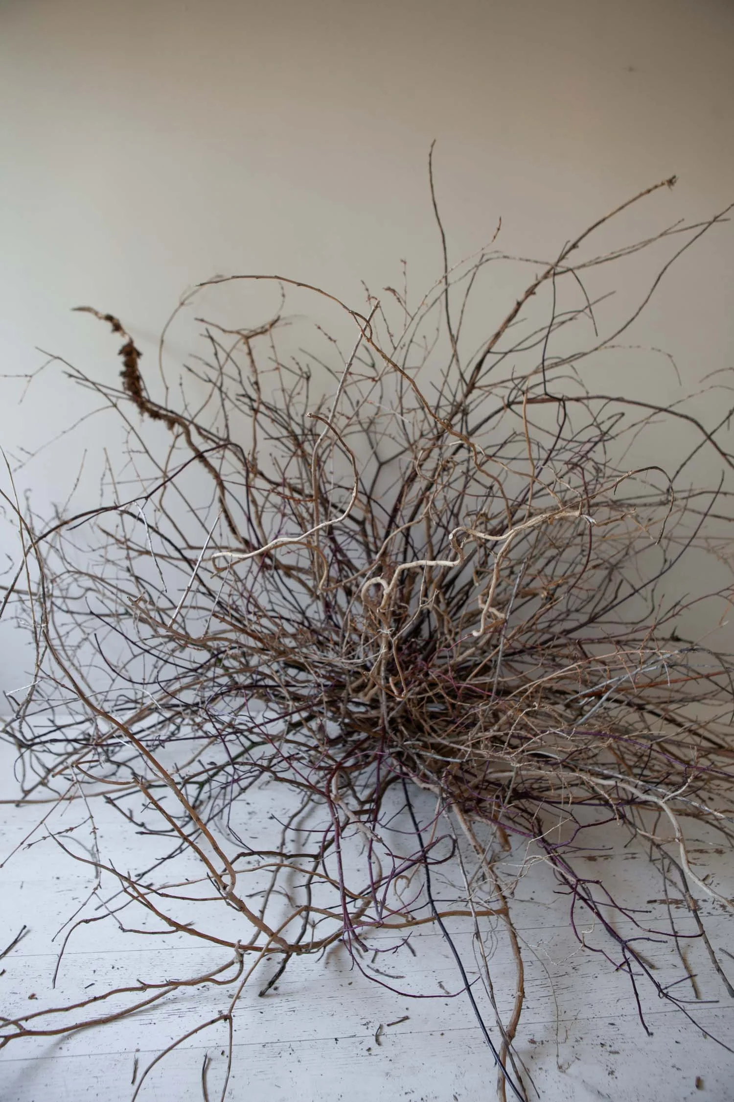
Chapter: Anger (or actually: Fight)
My inspiration: the loudness, the aggression of a fight. Like an explosion of energy. With a dash of Sleeping Beauty.
I knew this theme had to be red, as it’s the most aggressive color. I looked up meaning of flowers and apparently orange lilies represent hatred. Poor lilies. I create the burst of branches the day before I started photographing. On day 2 I added the flower heads, without tubes or any other water source as I didn’t have any way to cover up mechanics. I chose flowers that are hardy enough to last a little while without water, like standard roses and chrysanthemums.
The spiky branches are spent coleseed blooms, they do a perfect imitation of really sharp thorns. All without hurting my fingers because there were actually less nasty than the dried statice ;)
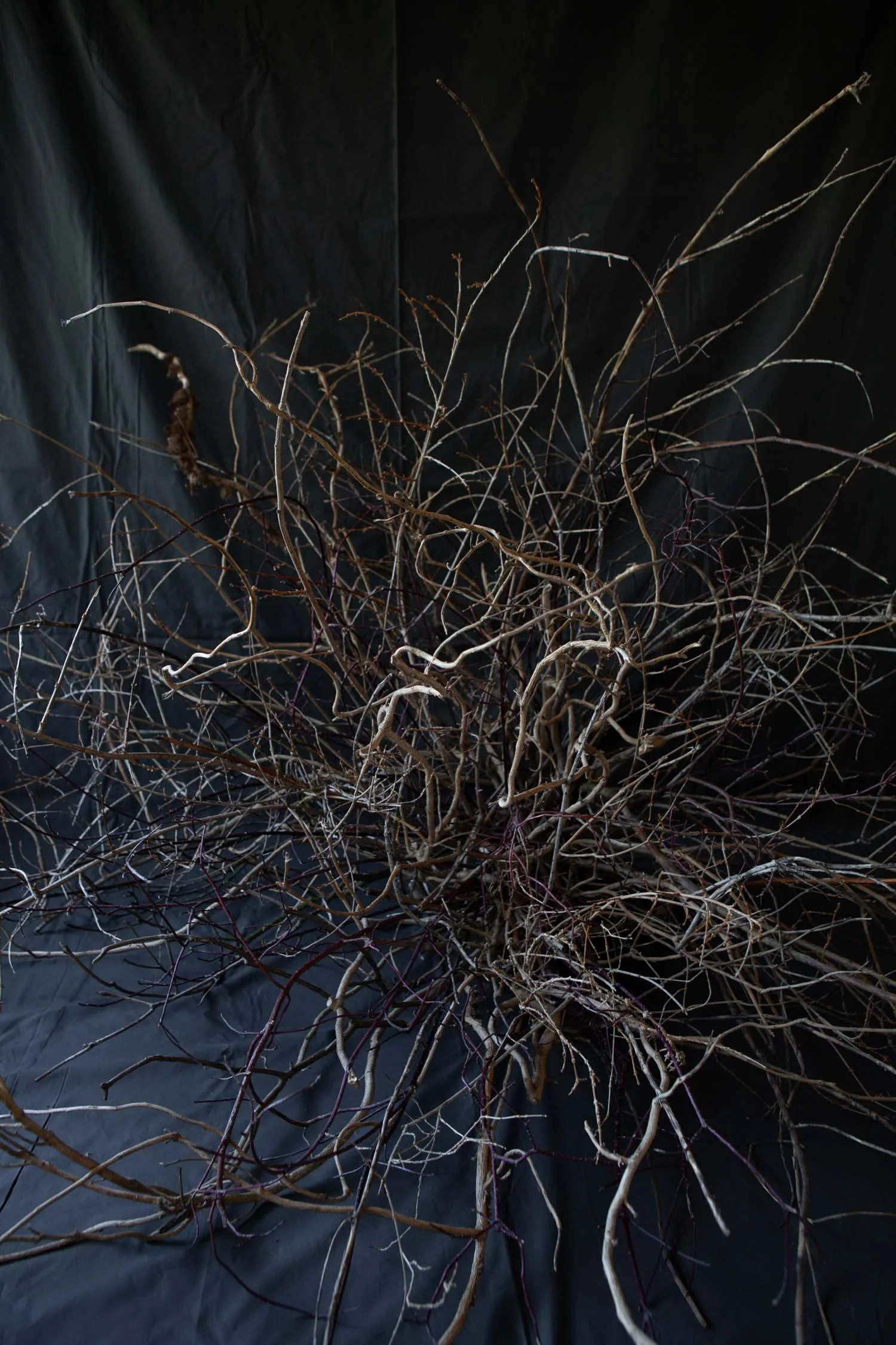
Ah, the power of a dark backdrop. It makes all the difference, even without any flowers. And I wanted something with high contrasts, so unlike ‘Guilt’, the dark worked for this theme!

As you can see, I experimented with movement in these photos haha! They didn’t make the final selection but I thought this one was cool enough to share. Not every flower photo has to be ‘pretty’. Sometimes it can be raw and wild and honestly.. a bit random.
Keep scrolling though, because if you look at this for too long you might go trippin’. Or start seeing dinosaurs like in those old 3D books. Which is also trippin’ lol!

I’m so glad I made a few timelapses of my process. Most installations for this book took at least a week to create - including 2 days of creating & photographing. To see a part of it happen in just 2 minutes is.. well.. interesting but fun haha!
Notice the scattering of the petals in the end. It’s all about those finishing touches! The one I pierced on one of the coleseed spikes actually made the cover of the book. Lucky petal, your sacrifice was not in vain!
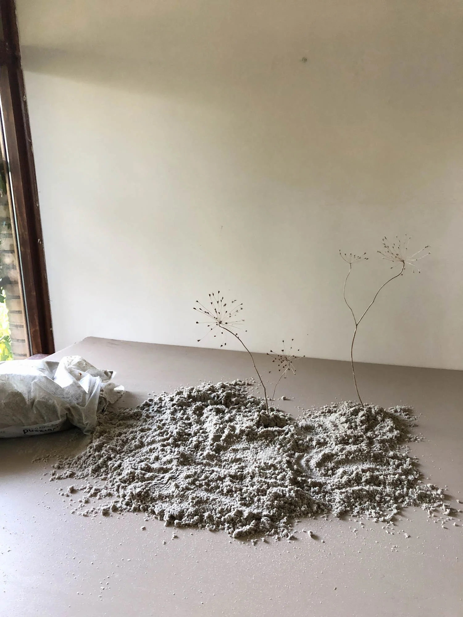
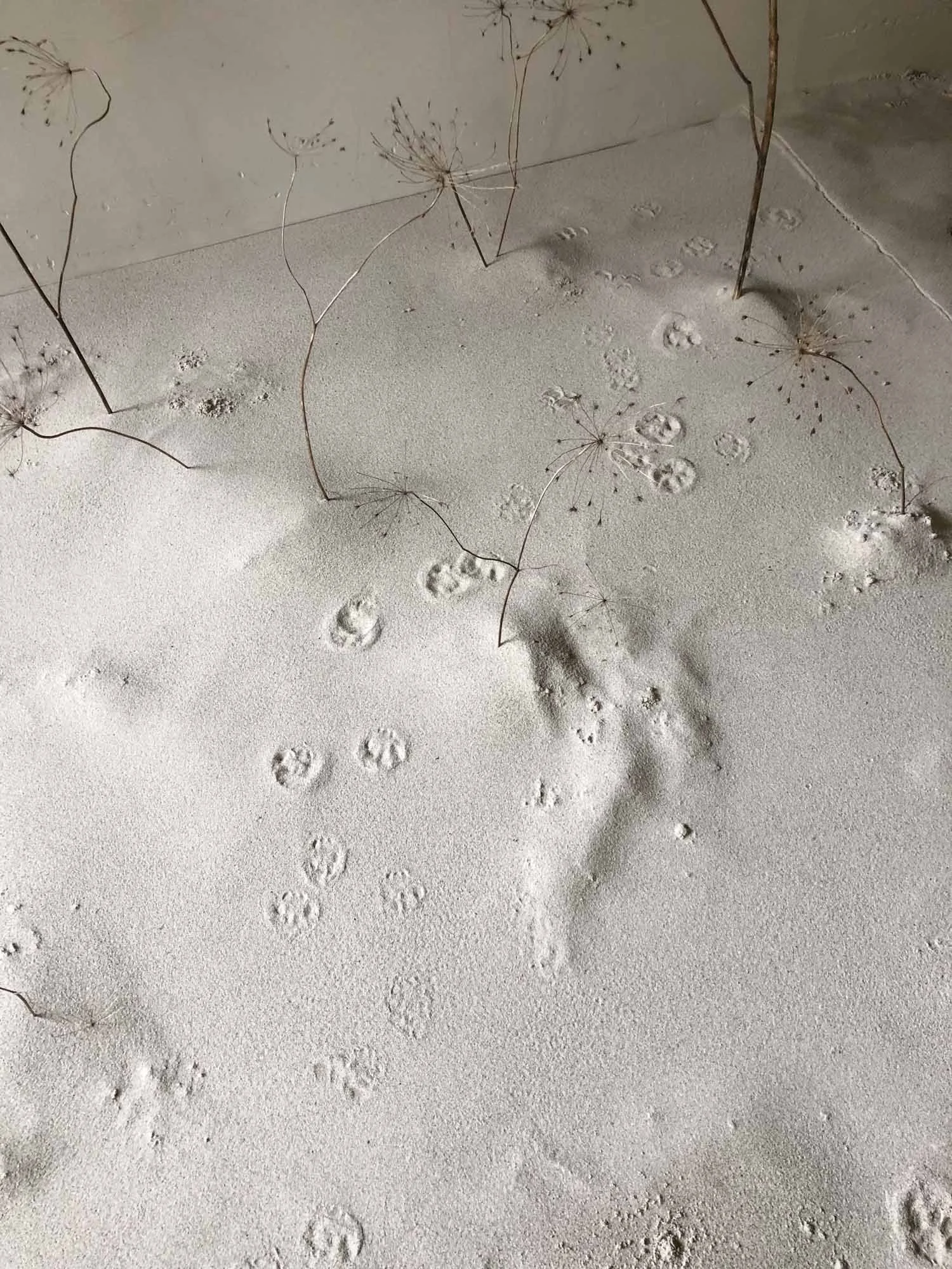
Chapter: Loneliness
My inspiration: a desert like landscape, emptiness, traces of someone’s impact like faded footprints.
This design almost felt too simple for me. You know, because of my maximalist life and all. I wanted to create a still scene with dried ammi flowers. Something very empty, white, bare.. almost transparant. Less is more.
So I bought 4 bags of silver sand, put my flowers in pin frogs and scattered the sand around & over them. And then it looked like the photo above. Chunky and dark.
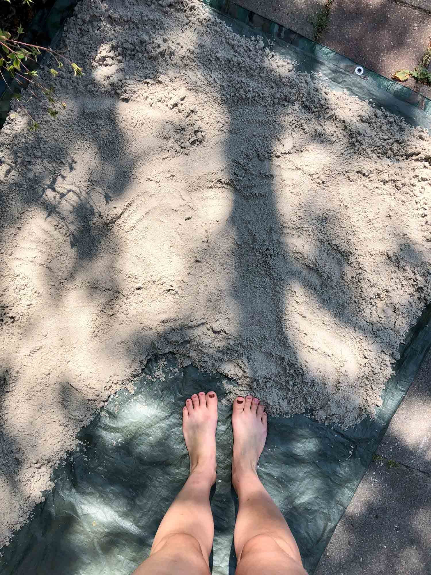
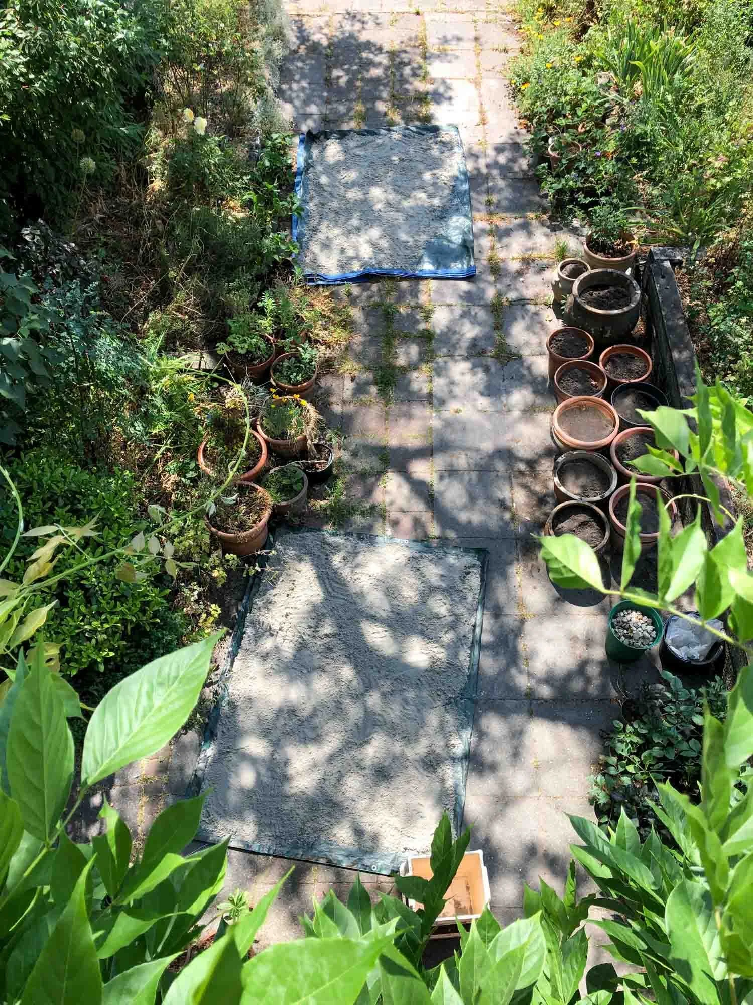
I think the universe wanted me to have that typical Anne experience of work harder, not smarter. Because I had to spread out all the sand in the sun so it could dry and become soft & white. Luckily I created this design on a very HOT day in June so it dried pretty quickly. And I could eat icecream while waiting.
Once a batch was dry, I scooped it all back in a bucket and spread out the next batch. For the perfect texture, I sieved the sand over my base plate. There’s a pretty satisfying timelapse below for you!

If it looks zen.. that’s because it actually was. It also helped that it is cool in my studio with that nutso heatwave going on outside. Hence the shorts, tanktop and bare feet ;)
I shared some backstage moments on my instagram and people thought I was creating my own beach to lay on that day. I wish!
You know the thing about loneliness?
If you have a cat.. you are never really alone!
So glad this was after I took the photos. Little terror Nalu.
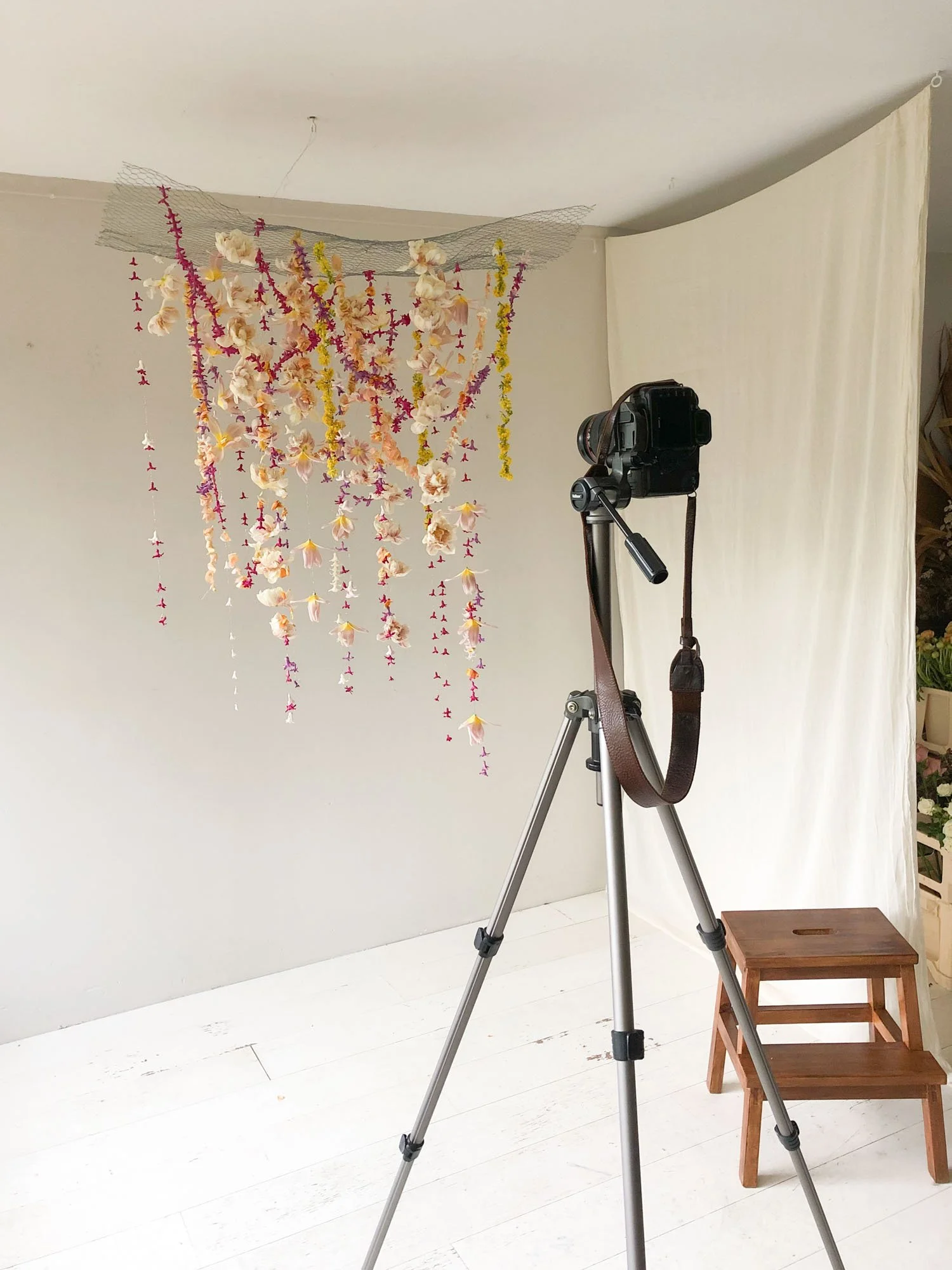
Chapter: Relief
My inspiration: a butterfly migration - the air filled with flapping colourful wings.
I knew relief had to feel free, optimistic, light, airy and full of colour. So a hanging piece made sense to me. That way, I could encoorperate the airy element and create the opportunity of movement.
Inspired by my floral friend Sue (@passionflowersue) I strung hundreds of hyacinth flowers, petals and tulips on gold wire. All garlands together created this India-inspired moment with pink, yellow and orange all mixed up. It looked super festive and happy. Perfect for relief! And by making the garlands intersect and change directions, it had that slightly chaotic butterfly feeling.

I hardly took photos of the process of making ‘Relief’. Too busy threading flowers and racing against my fresh flowers / daylight deadline. But I took some videos afterwards that really show the colours and beauty of the garlands.
Fun fact: most of the hyacinths were generously gifted to me by a local nursery we always go to. I needed flowers that were in their prime and apparently, those are to be the ones they couldn’t sell anymore. Because people expect a certain ‘vase’ life on their flowers and these were too far gone.
Which is lame because they still lasted for a LONG time afterwards. Even the stringed ones kept looking great for days! But hey, one man’s trash is another florists treasure. Thank you Kwekerij Groeneveld :)
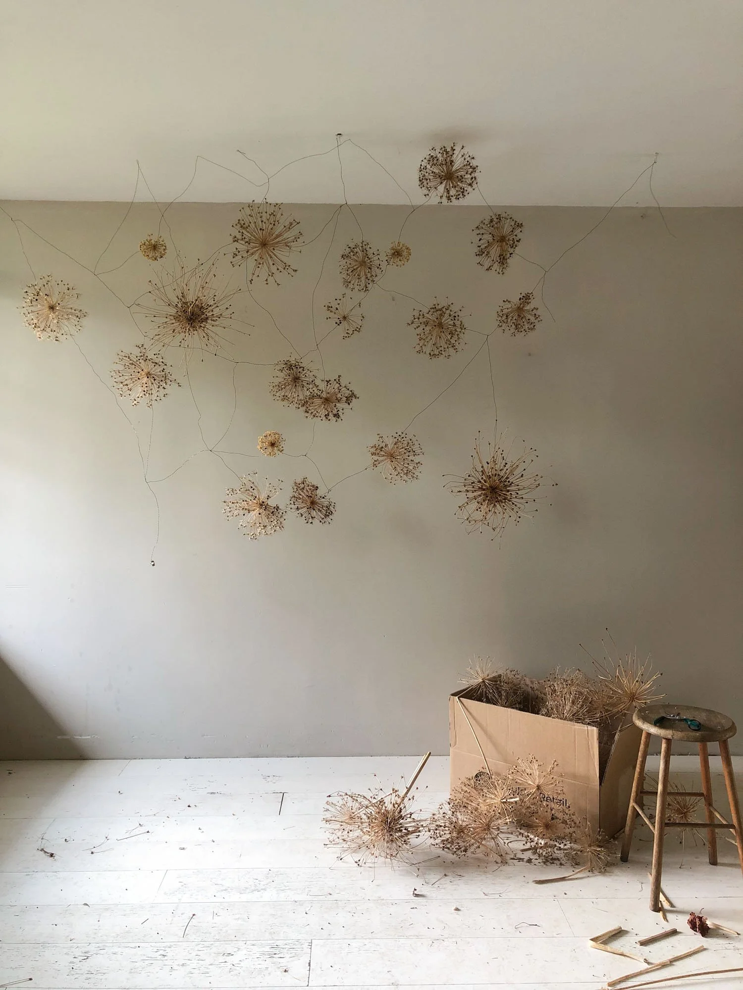
Chapter: Fear
My inspiration: I read all the texts before I started brainstorming and in one of the stories there was something about ‘open nerves’. Like they are so sensitive, everything just feels tense. Together with an inspirational image of a nervous system, that fuelled my inspiration.
I had a huge amount of dried allium seedheads. And they are just the perfect depiction of something that feels tense and painful. I used dark metal wire to create a grid - the nervous system - hanging in my studio. This piece grew organically as I worked on it. I added alliums, weaved in more metal wire, added more alliums.. repeat.

There’s a clip in this timelapse where you can see the process in real time. No sped up movements, just me weaving metal wire to create this huge network of connections. Because sometimes it’s nice to see the actual speed :)
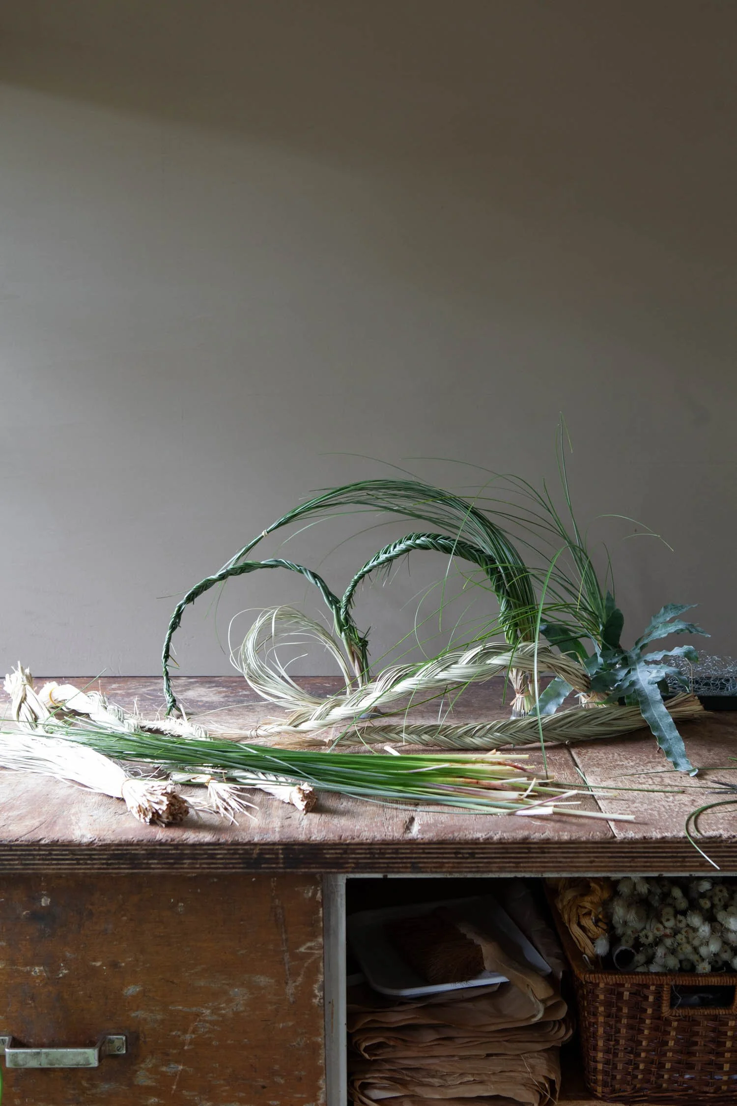
Chapter: Carry On / Perseverance
My inspiration: I immediately thought about motion, about repetitive shapes and some sort of weaving. I decided to use grasses and flowers in a very natural palette, to stay close to the Earth. That’s why I used my wooden tabletop as a background as well.
By moulding grasses into loops, circles and curves I tried to show the motion and change you go through when you try to carry on after a loss. The shapes may change, but you are still moving forward. No matter how large or small the steps you take are.
I used pin frogs, a tray with chicken wire and a few other vessels in here to make sure everything stayed in its own place. And I added a few yucca leaves from our garden to add colour and a larger graphic element.
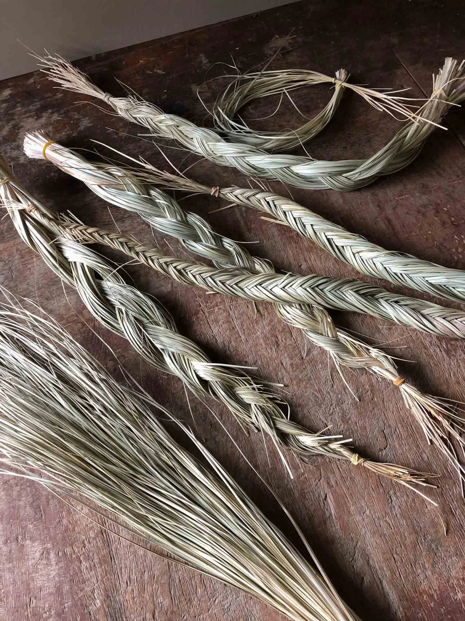
I love weaving and braiding branches for my installations but somehow this was the first time braiding grasses. Despite all the grass cuts, this was so relaxing and meditative to do. Seriously could do this for days!
And the symbolism, of things become stronger together.. well that’s just a cherry on top!
You’ve made it to the final photo! This little ‘Danique-appreciation’ moment. My dear friend and talented photographer edited the photos for me and more importantly: she was there to give me feedback on every design while I made them. Get yourself a creative friend like her! <3
I hope you enjoyed this peek behind the curtain! If you missed the final images, you can find the blogpost here. And if you have any questions, simply leave a comment below and I’ll get back to you.
Curious about the (Dutch) book? You can order it via this website! It’s only €20, including shipping if you live in the Netherlands.
There are no plans for an English version - yet! If you are interested, leave a comment below. If there are more than a 1000 people (or investors) ready to buy we can think about it :)
Need some beautiful floral art for your brand or project?
You can contact me here!
Thank you for reading!
Lots of love,
Anne